“I don’t want to offend you guys, but you’ve got to change these colors,” he said, brushing his thumb across one of our business cards. “Why did you choose these?”
The Mosaic team looked at each other and sort of shrugged.
The answer was because we were presented with a variety of color patterns when we first saw possible logo designs, and we just sort of pointed at one we liked. In other words, the answer was: Just because!
Our dinner companion was Brent Warwick, a partner in ipsoCreative, and it was our first meeting. He has become something of an adviser, mentor and friend, and if you spend five minutes with him, you’ll discover as we did that offensive things don’t come from such a man.
He told us a story about Josh Mitchell, an ipso partner and the agency’s creative director, and I’ll never forget it. In his job before this one, Josh had a boss once say to him: “There is only ONE thing certain to get you fired here. And that’s if someone asked you WHY you chose a particular design element and you don’t have an answer.”
I asked myself: Is it reasonable to expect creators to have a reason for every choice they make, no matter how inconsequential it may seem?
It didn’t take me long to realize: No. It’s not unreasonable. A craving for laziness is the only real argument against it. And when’s the last time that helped anyone?
We were super-intentional when choosing the name Mosaic, so why not be equally intentional with our brand colors?
There is no shortage of color psychology information available online. We studied those infographics and read whatever we could find to help us choose the best colors to tell our brand story. We all agreed to keep the word “Mosaic” black, and to keep black elements within the “O.” A. Because black is already awesome, and B. Because a good life tip is to make sure you create logos you can use in a black-and-white application without totally losing your brand identity.
Eliminating shading and brightness from the conversation, you’re looking at the following colors and corresponding meanings, and I’m going to put in bold all of the words I believed to represent Mosaic, the way we do business, and the human beings who comprise our team.
Blue – Trusted. Dependable. Honesty. Calm. Secure. Cool.
Black – Sophisticated. Luxurious. Style. Elegance. Authority.
Red – Bold. Passion. Strength. Attention. Love. Exciting. Action.
Yellow – Logical. Optimistic. Creative. Confident. Playful.
Orange – Happy. Energetic. Sociable. Friendly. Enthusiastic.
Green – Nature. Wealth. Fresh. Life. Environment. Growth.
Purple – Royalty. Mystery. Ceremony. Unique. Majesty.
Rainbow-Colored – Fun. Easy-going. Child-like. Multi-disciplinary.
We spent a lot of time kicking around words and ideas that speak to who we are and who we want to be.
The idea of being trusted through the repeated demonstration of honesty and dependability was a no-brainer. Remember how Kris Kringle in Miracle on 34th Street sent a couple of Macy’s-shopping mothers to rival New York City department store Gimbels where they could find certain toys and a better pair of ice skates? That’s who we want to be. Minus the beards.
If it ever becomes apparent that greed and dishonesty are the best strategies for long-term business success, we’ll probably change the blue to whatever best represents: Sucky People.
So, we chose BLUE.
The complementary color had to be either orange or yellow, because both are very us, but which?
In the end, words like “logical” and “optimistic” and “confident” and “playful” won the day, and do an adequate job of conveying the warmth and friendliness we liked in the color orange.
So, we chose YELLOW.
And knowing the risk of alienating all of our Ohio brethren who bleed scarlet and gray as Ohio State Buckeyes fans by donning the color scheme of their Michigan rivals in Ann Arbor, we decided to stay true to our brand story.
Blue. Because we’re going to tell people the truth and we’re going to be reliable.
Yellow. Because we choose hope, optimism and creativity. Because we’re not going to hide our playfulness in the interest of decorum. (Fine. Maybe Justin and Austin will. They’re the “mature ones.”)
When some well-meaning Ohio State fan comes at us with “I really like the ‘O’ in your logo. What made you go with blue and yellow? Because Michigan’s the worst and I’m kind of holding it against you right now,” we don’t have to shrug and look around the room like a bunch of drooling mooks.
Black, because we know what we’re doing.
Blue, because we’re transparent and put human beings first.
And Yellow, because we’re kind of awesome.
It’s a story we are proud of.
We hope it’s a story our friend Brent can be proud of.
And it’s definitely the story of why we have 79,000 (slight exaggeration) business cards we can never hand out again.
Which is totally my fault. (I’m sorry, trees. Seriously.)
We believe that everything should evolve; humans, businesses, relationships, goals, motivations, etc. as long as there is a purpose for the evolution. We certainly don’t exclude ourselves from the desire to evolve and be better. Because of this we will always listen to feedback and take any form of learning and advice seriously. With the first color change, we learned how to be intentional and approach everything with purpose. That’s exactly how we approached our rebrand.
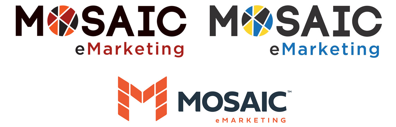
“Austin, to me the O in the Mosaic logo does not look like a O. When I see the logo, I see M-SAIC.” said a friend and talented designer.
I took a look and thought to myself, “huh, yeah I guess I can see why you see that. I wonder if others see that same thing.”. This piece of feedback sparked market research to understand if other’s experienced the same thought while looking at the Mosaic logo. It turns out it did!
Not only did this feedback help nudge us towards a potential rebrand, we felt like it was the perfect time because Mosaic itself had been evolving. We wanted a new, recognizable, attention grabbing logo that would be the face of our business. We also wanted to a new website that did a better job of a) representing our work, and b) talking about who Mosaic is, what we offer, and how we can help. Because of these factors, it all started coming together.
To kick the project off, we first applied our learnings from the first color change. We were intentional about picking our colors. The entire reason we switched from yellow to orange (Go Browns!) is because we couldn’t forgive ourselves for picking Michigan colors the last go around. Just kidding …
Although Mosaic does stand for the same things yellow stands for, we are logical, optimistic, creative, confident and playful, we felt that orange was a better fit to be one of our primary colors. We take pride in building lasting relationships with our clients. We see ourselves as happy, energetic, sociable, friendly, and enthusiastic, which has helped us build strong relationships. I am happy so say, our client retention rate is substantially higher than the industry average, and it’s because we are very good at the work we do, and we love our relationships and will always approach them in a friendly way.
Yellow – Logical. Optimistic. Creative. Confident. Playful.
Blue – Trusted. Dependable. Honesty. Calm. Secure. Cool.
Orange – Happy. Energetic. Sociable. Friendly. Enthusiastic.
We then did competitive research to come up with ideas that might be able to help us stand out. From there, our designer came up with multiple concepts for us to consider. We went through the selection and revision process, and Voila, below is the new Mosaic logo.
So. What are your brand colors and why were they chosen? Would knowing that story make a difference for your business? Could telling that story help you better connect with those who need your help?
Only one way to find out.
 (888) 924-9349