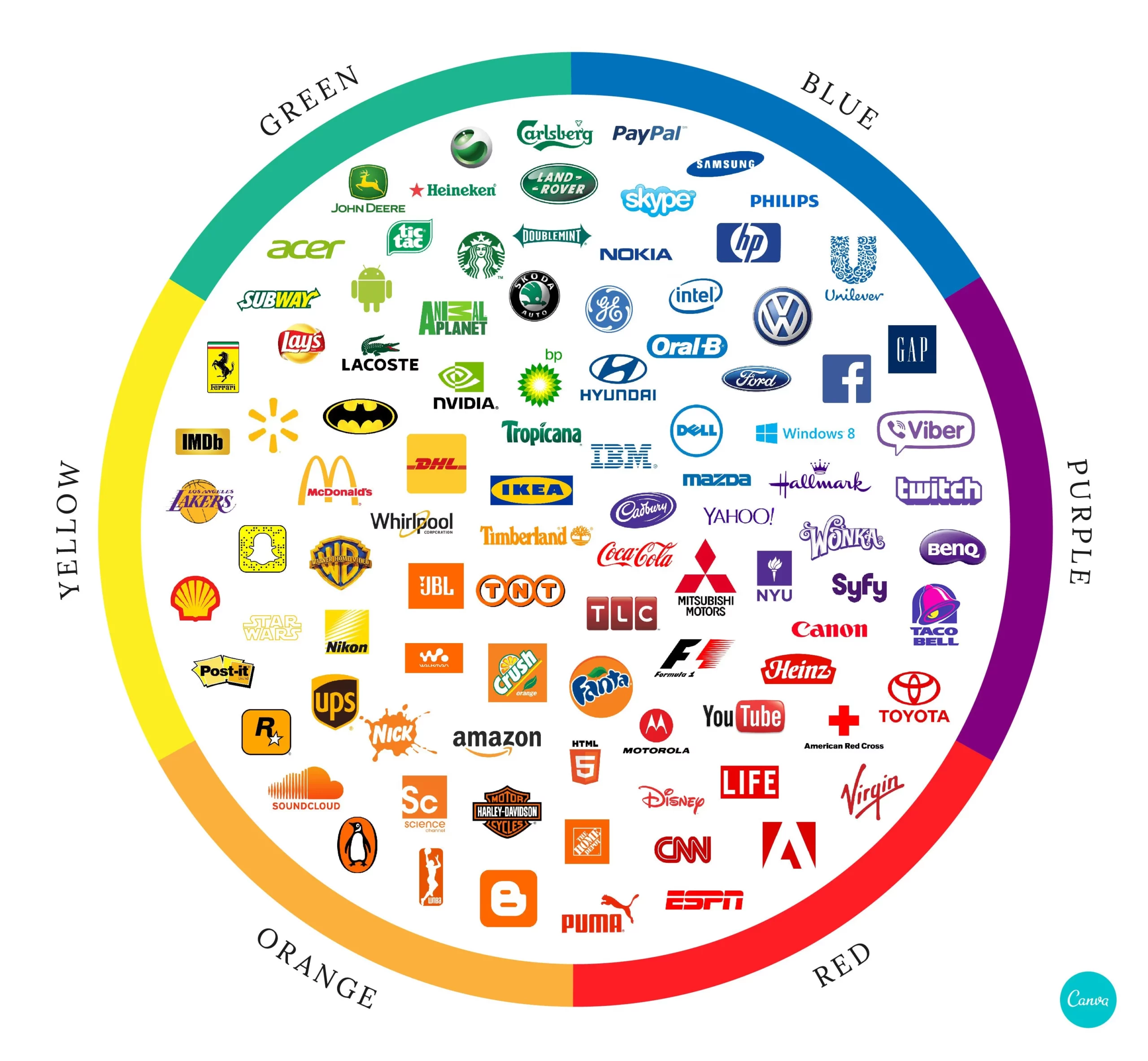
Colors have an incredible influence on our emotions, thoughts, and perceptions. Thus it is incredibly important to understand “The Power of Colors in Branding” and their ability to evoke specific feelings and create strong connections within us. Harnessing the psychological impact of colors is a powerful tool for businesses when it comes to branding. Whether it’s choosing a logo, designing a website, or creating packaging, understanding the meanings associated with colors can help convey the right message to the target audience. In this blog post, we will delve into the captivating world of colors in branding and explore the hidden meanings they hold
Red is a color that demands attention. It represents passion, energy, and excitement. It stimulates the senses, increases heart rate, and creates a sense of urgency. Brands like Coca-Cola and Red Bull use red in their logos to evoke a feeling of vitality and enthusiasm, making their products appear vibrant and dynamic.
Orange is a vibrant and energetic color that symbolizes enthusiasm, vitality, and approachability. It combines the passion of red with the friendliness of yellow. Brands like Fanta and Harley-Davidson incorporate orange into their branding to create a sense of adventure, excitement, and a fun-loving spirit.


Yellow is a vibrant and cheerful color that represents happiness, positivity, and optimism. It grabs attention and radiates warmth. Brands like McDonald’s and IKEA utilize yellow in their branding to evoke feelings of joy, friendliness, and affordability. However, it is important to use yellow judiciously, as excessive amounts can create feelings of anxiety or caution.

Green is closely associated with nature, growth, and harmony. It represents freshness, tranquility, and sustainability. Many eco-friendly and organic brands incorporate green into their logos and packaging to convey a sense of environmental responsibility and well-being. Brands like Starbucks and Whole Foods Market utilize green to align themselves with nature and health-conscious consumers.

Blue is often associated with trust, stability, and reliability. It has a calming effect and promotes a sense of security. Many technology companies, such as IBM and Facebook, incorporate blue into their branding to convey a feeling of professionalism, credibility, and intelligence. Blue is also prevalent in healthcare brands, as it symbolizes cleanliness and trustworthiness.


Purple is often associated with creativity, luxury, and wisdom. It has a mysterious and elegant quality. Brands like Cadbury and Yahoo use purple in their branding to evoke a sense of sophistication and creativity. Purple is also associated with spirituality and imagination, making it a popular choice for brands in the beauty and fashion industries.
Colors play a vital role in branding, as they have the power to influence perceptions, evoke emotions, and create strong connections with consumers. Understanding the hidden meanings behind colors enables businesses to align their branding with their desired message and target audience. However, it is crucial to consider cultural and contextual factors when choosing colors, as different cultures may interpret colors differently. By leveraging the psychology of colors in branding, businesses can establish a strong brand identity, enhance customer engagement, and leave a lasting impression on their target market. So, the next time you encounter a brand, take a moment to observe the colors used—there’s a world of meaning waiting to be discovered.
Need help to identify what fits your brand? We can help!